
It would be almost impossible on this modern-day to digitally represent any graphical data without any use of colour simply because it makes the whole concept of digital data visualisation as well as representation clearer, detailed, and organised. However, it is worth mentioning that any use of colour in a graphical representation should be driven by good ideas on which reflects meaning as this would allow the designers to defend their ideas. Meaning, colour decisions should not be randomly or arbitrarily chosen because of an individual’s preference (Tufte, 1990).
For instance, when looking at the graphical representation statistics on COVID-19 published by WHO (World Health Organization) as shown below in the Fig-1 (COVID-19 most affected countries around the world (WHO, 2020)), one can clearly notice different colours within the map representing most affected areas worldwide marked with light blue, blue, navy blue and yellow not affected by the virus.
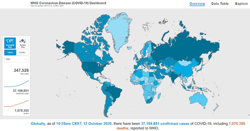
Fig-1 – COVID-19 most affected countries around the world (WHO, 2020)
According to (Tufte,1990) the use of colour should be guided by good ideas as well as having specific reasons for using each particular one because a designer should defend their ideas through it while drawing the audience’s attention to the most important elements. For example, when looking at the above Fig-1, one’s attention is undoubtedly drawn to the most affected countries represented in navy blue. This comes to prove that any colour choice should simply speak for itself. The idea behind the representation in Fig-1 is simplified by using colour in order for the readers to have a clear understanding of the World Health Organization’s interpretation of the gathered data on COVID-19 from February 2020 to this day.
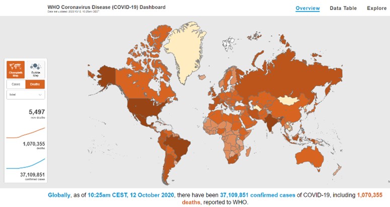
Fig-2 – COVID-19 countries with most deaths (WHO, 2020)
However, as they had to also report the number of deaths within the same graphical representation as shown in the above Fig-2, there is a complete contrast of the colours used to represent such while keeping the same design structure. Design-wise this would automatically tell the audience that they have now switched tabs and are now looking a different data but the same topic.
Some may argue about the colour choices, but in all when analysing any coloured graphical data the question should be whether the design choices work which in this case seems to be clear and simple as they used orange colour to give the audience a sense of danger. Tufte advocated the limited use of strong colour on a plain, neutral background draws the audience’s attention to important elements (Tufte, 1990). As seen on both figures with a plain grey background which represents the ocean.
References:
Evans, H., 2020. The Importance Of Colours & Shapes In UK Safety Signs. [online] Fastsigns. Available at: <https://www.fastsigns.co.uk/blog/detail/2017/06/02/the-importance-of-colours-shapes-in-uk-safety-signs> [Accessed 16 November 2020].
Lytle, J., 2020. Color Has Meaning — Juice Analytics – Build Data Products And Visualization. [online] Juice Analytics – Build Data Products and Visualization. Available at: <https://www.juiceanalytics.com/design-principles/color-has-meaning> [Accessed 4 November 2020].
Rebecca Surya, C., 2019. How To Use Color In Data Visualization. [online] Medium. Available at: <https://medium.com/fm-stories/how-to-use-color-in-data-visualization-829d6f0e70b4> [Accessed 7 November 2020].
Tufte, E., 1990. Envisioning Information. 1st ed. Cheshire, Conn.: Graphics, pp.81-93.


